Email us for an obligation free quote
Colours Meaning and Useage
In logo and graphic design
 When it comes to logo design or graphic design, colour can evoke powerful emotions from people.
Colour is the most instantaneous and wonderful means for delivering and communicating messages to your target audience. The colours that you select for a logo design or a promotional graphic design piece are not simply there to just make things look attractive; they can carry a deeper meaning that can affect consumer behaviour.
It is always best, however, to know what colours signify and communicate before using them. Here are some of the popular meanings that colours.
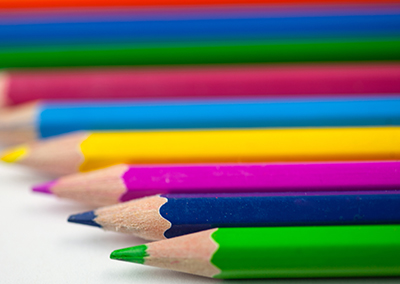
The three primary colours are:
RED – YELLOW – BLUE
These tend to be the colours most people are drawn to. For example, the most popular colour in the world amongst adults is BLUE. Amongst children, it is RED, while YELLOW, the most luminous colour in the spectrum, tends to draw the attention of infants and toddlers with developing vision.
RED is the most passionate colour and tends to excite and get the adrenaline pumping through the body. It is associated with love and anger; it can mean good luck, represent lust or adultery (as in the “red-light district”), or danger.
BLUE the most popular colour universally symbolises serenity and tranquillity. It has a calming effect if used in moderation, or suggests deep depression if the viewer is inundated with too much blue. Part of the soothing qualities and appeal is attributed to the sky and the ocean. Blue is a cool colour and often associated with cold things, such as frozen food. Additionally, blue is suggestive of both quality and expertise (Blue ribbons are given to first place winners.) Because of these positive attributes, blue is the most popular and widely specified colour in corporate identity programs.
YELLOW is the most luminous colour of the spectrum. Because of its high visibility warning signs are often painted this colour. Yellow traditionally represents the sun and is a most cheerful colour when used in moderation. If used too liberally it can tire the eyes and make people irritable (couples with yellow kitchens tend to argue more often when in these areas!). Conversely yellow has also become associated with greed and cowards (In the 10th Century doors of traitors and criminals were painted yellow in France).
GREEN is a cool colour with soothing properties similar to blue. This relaxing hue is associated with growth and prosperity as well as health and wellness. It can also suggest envy and jealousy as in the “Green-eyed monster.”
ORANGE is a warm colour often associated with good things to eat, and so it is the most edible colour, which explains why so many fast-food chains use it as part of their colour scheme.
PURPLE is universally associated with royalty and spirituality because in ancient times only emperors and kings could afford garments made of purple dye.

Some meanings of different colours
Stimulates and can signify danger, love, passion, desire, bold, sexy.
The most cheerful colour if viewed briefly, most fatiguing if viewed for too long, caution, suggestive of the sun and gold.
Brown is flavourful, suggestive of chocolate, meat and bread, associated with earthiness, rich, warm, mellow.
Elegance (as in black-tie event), serious, strong, darkness, powerful.
Symbolic of purity, cleanliness, goodness.
Why not check out some of the different colours used in some of our recent logo designs or business cards.
CALL NOW!
Connect with Clark Marketing & Design
When you work with Clark Marketing & Design, you’ll find the experience to be a pleasant one,
done with expertise and a minimum of fuss.

